
About Visual Identity
Arts Maebashi was established as an arts and culture facility that enables the residents of Maebashi City to become proactively involved in the facility’s business management, operation, appreciation and promotion. While focusing on the arts, its purpose is to provide for a wide range activities, diverse forms of participation, and creation through collaboration.
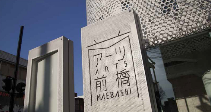
The facility’s exterior converts the architecture of structure’s commercial past using white perforated metal, forming a symbolic design that connects the facility with the city as well as Maebashi’s past with its present. With this perforated metal as a starting point, the visual identity and sign design are based on the concept of lines connecting points together. These scattered points (the holes) are connected by lines, and become a design that creates letters and pictograms.
Each point represents people, city, art, and other various elements. The lines connecting these points represent the activities of Arts Maebashi. The symbolic logo as well takes the “mae” (meaning “before”) and the “M” in Maebashi as its motif; all of the letters are connected by unseen points and lines. The relationship between these points and lines is the power of creation; the power to create new forms in a space that was previously empty. It symbolizes the way Arts Maebashi will show us new possibilities in art through its activities and as a platform that connects people

NISHIZAWA Akihiro
Branding Designer, CEO of Eight Branding Design